Cirrus Realty / Stratus Realty
Brand Strategy
Naming
Copywriting
Andrea Trabucco-Campos: Design, Art Direction
Chris Corby: Web Development
The Brief
Cirrus Realty and Stratus Realty are two companies in one…or one-in-two. The Virginia real estate agency formerly known as Hampton Roads Realty approached me to help launch its new property and sales divisions, with two new names and a unified brand identity.
The Challenge
The challenge was to define a dualistic brand with related identities and identical values, but with distinct real estate services. The owners wanted either division to have equal priority, yet be clearly delineated.
︎︎︎︎︎︎︎︎︎

First, we established new names that distinguished both companies from their competitors (most of which are named after brokers) while conjoining their brands. We looked at the company “split” as an unique asset core to the brand position.
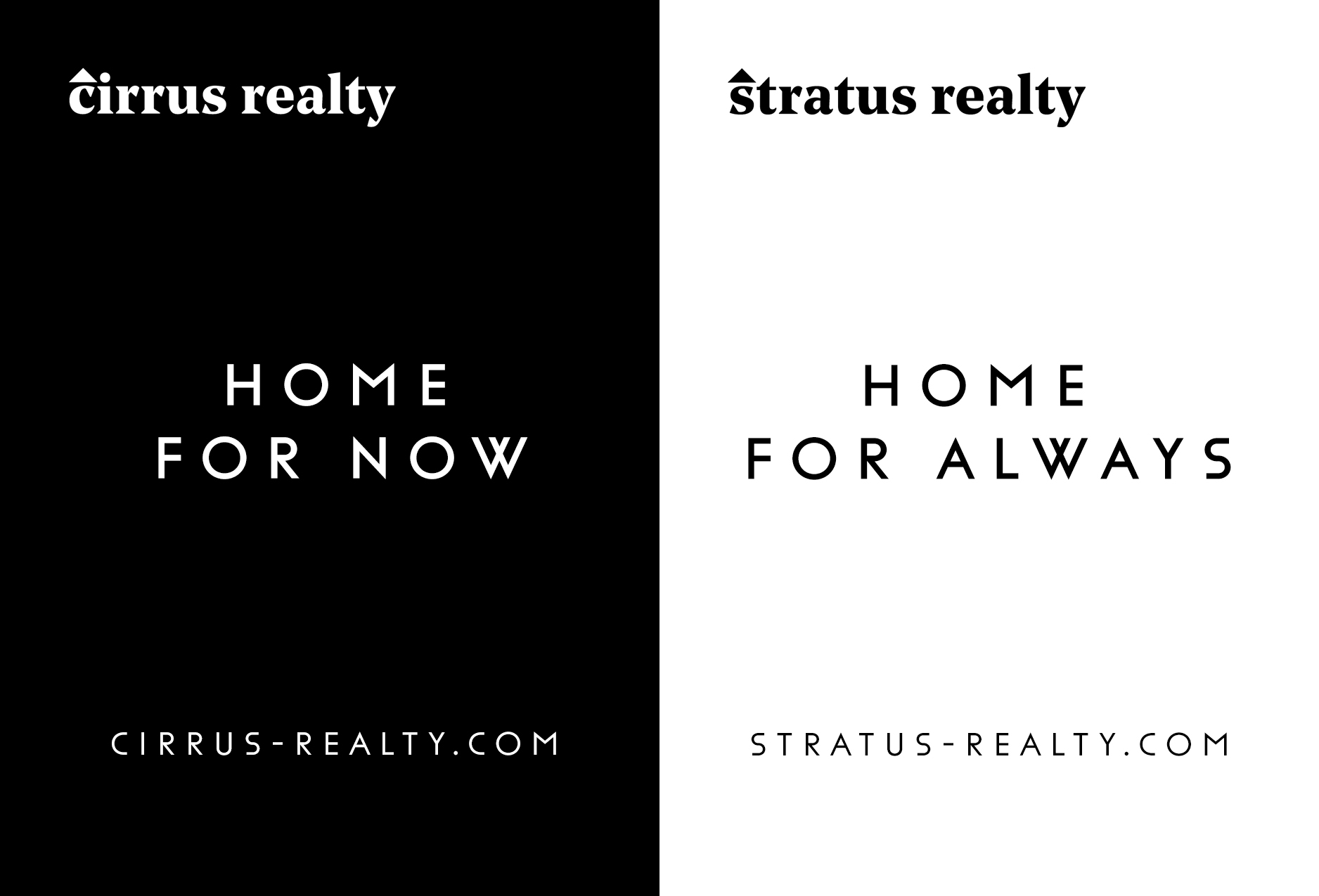
We landed on Cirrus Realty and Stratus Realty, referring to the two types of clouds and alluding to the ever-changing weather in the Hampton Roads region of Virginia.
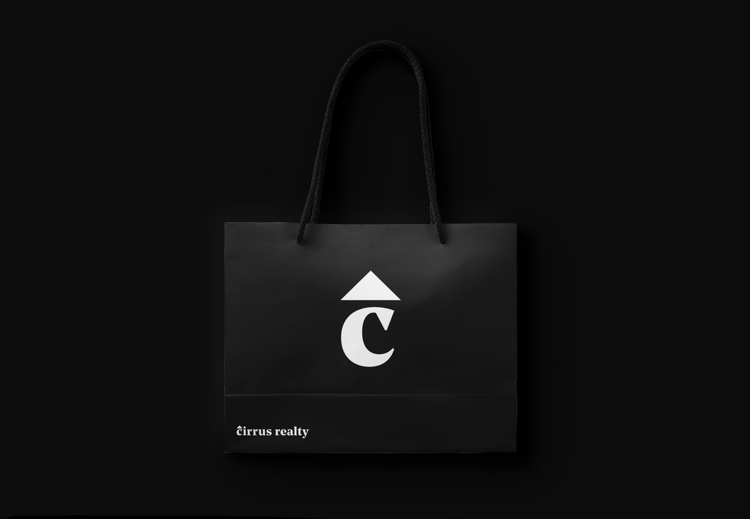
Next, we enlisted designer Andrea Trabucco-Campos to develop the logo and brand identity. The triangular shape of a roof — suggesting the shape of a house — is paired with the triangular typeface Noe Text, creating a sense of unity across both wordmarks. The functional black-and-white color scheme is shared across the two companies, with one simply being the inverse of the other.

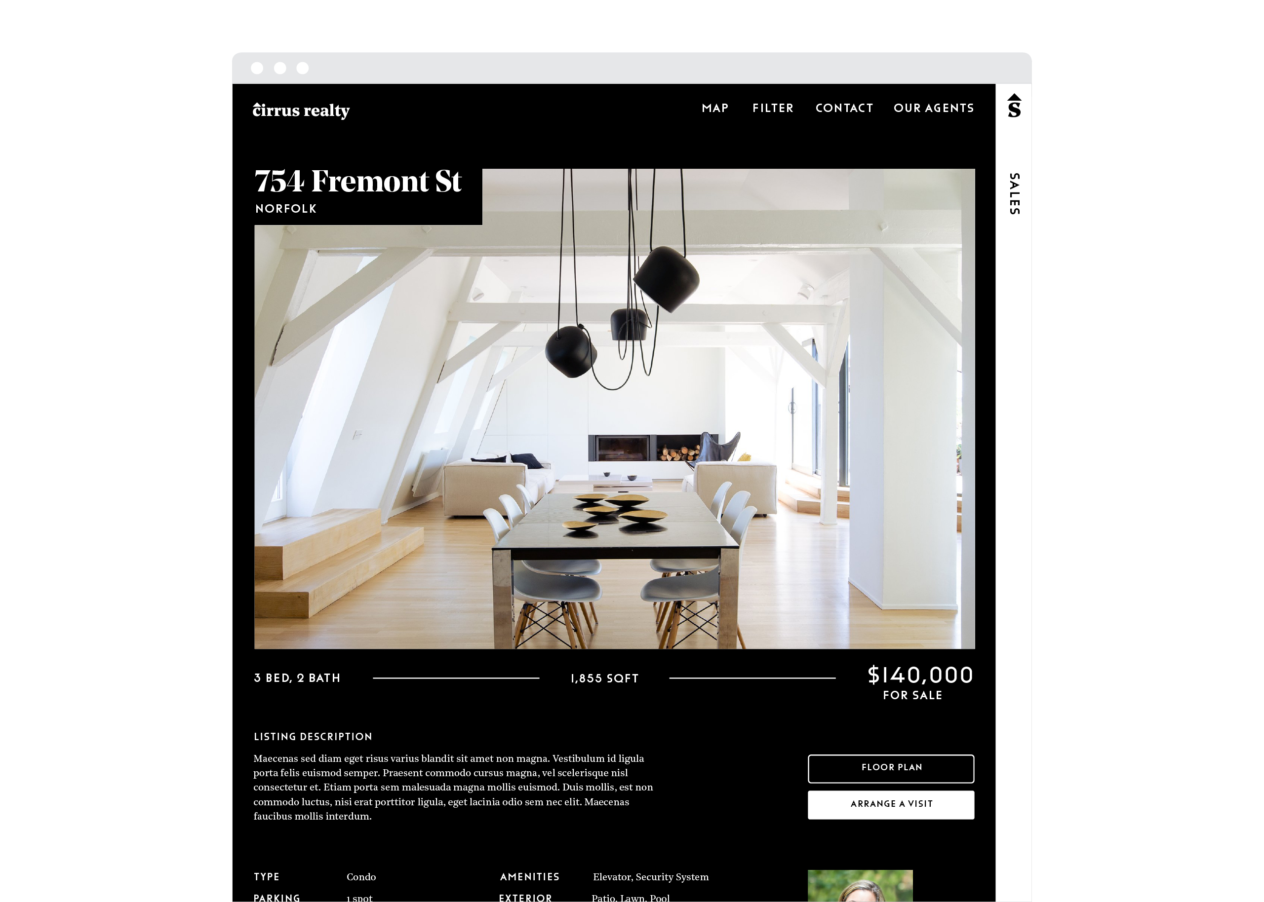
The sleek website, designed by Andrea and developed by Chris Corby, is core to the brand identity, and the primary digital touchpoint for customers of both companies. The lightweight design allows for easy navigation and smooth switching between divisions.
Web and promotional copy plays into the “sister company” concept when showing both brands side-by-side.


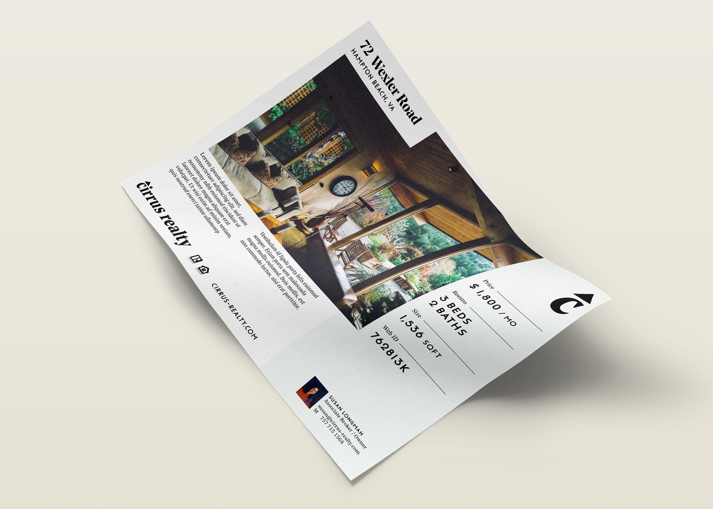
Photos by Andrea Trabucco Campos