The Brief:
Octagon Studios is a music recording facility in the heart of Brixton, one of London’s cultural hubs. I was asked to help guide the studio — formerly known as ArtSpace — through a brand overhaul following a massive renovation.
The Challenge:
The studios, comprising 5 individual suites, had been offline for several months following renovations and rewiring. The owners wanted to re-open the studios, but felt that its name and casual aesthetic as a project studio were overdue for an evolution.
The goal was to relaunch the space as a professional and commercial recording destination for both local South Londoners and international visitors alike.
︎︎︎︎︎︎︎︎︎
The Solution - Naming
The answer to our naming conundrum was hidden in plain, eight-sided sight. The unconventional live room (originally designed and developed by GS Acoustics for immersive audio testing), had always been known as “the octagon.”
After several rounds of naming, the owners settled on just that — Octagon — an angular, modern name that captured the spirit of a multifaceted community of music creators.
Plus, the visual possibilities would be a designer’s dream.

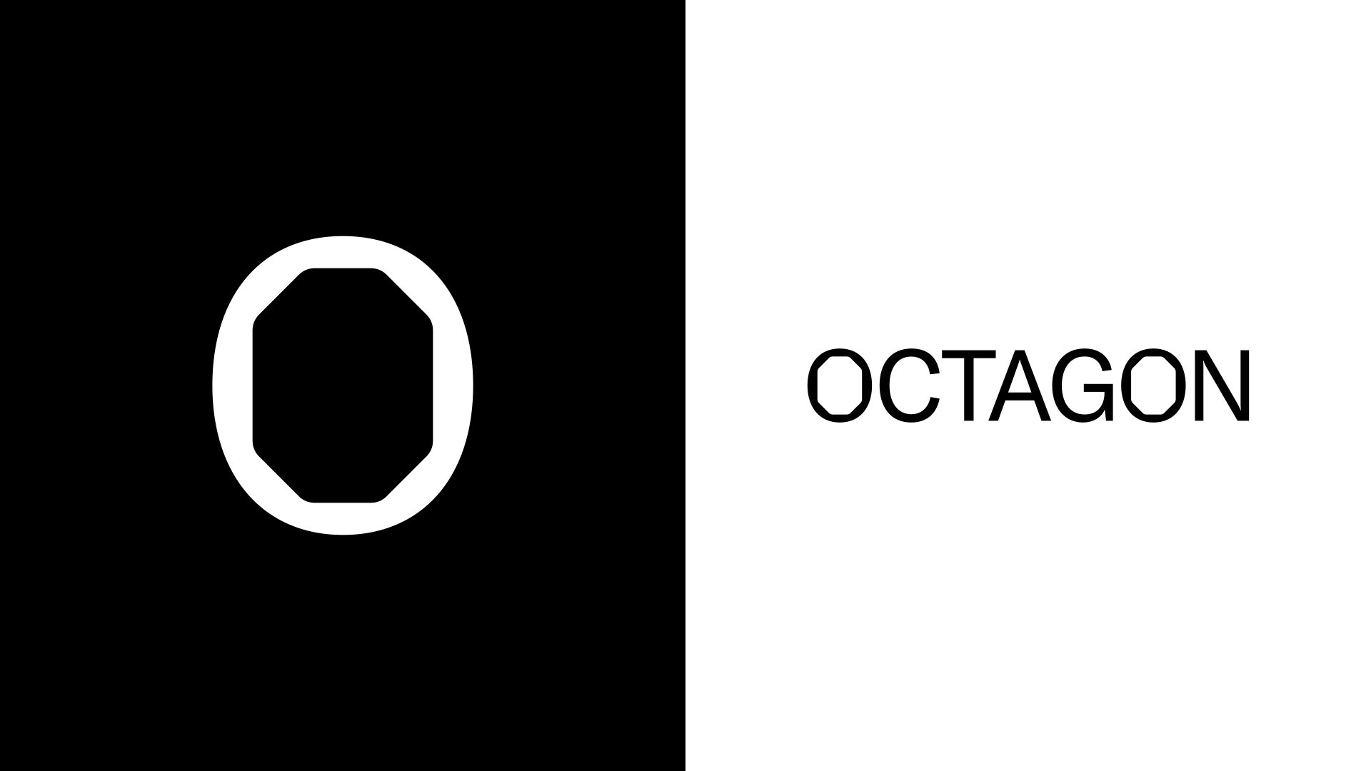
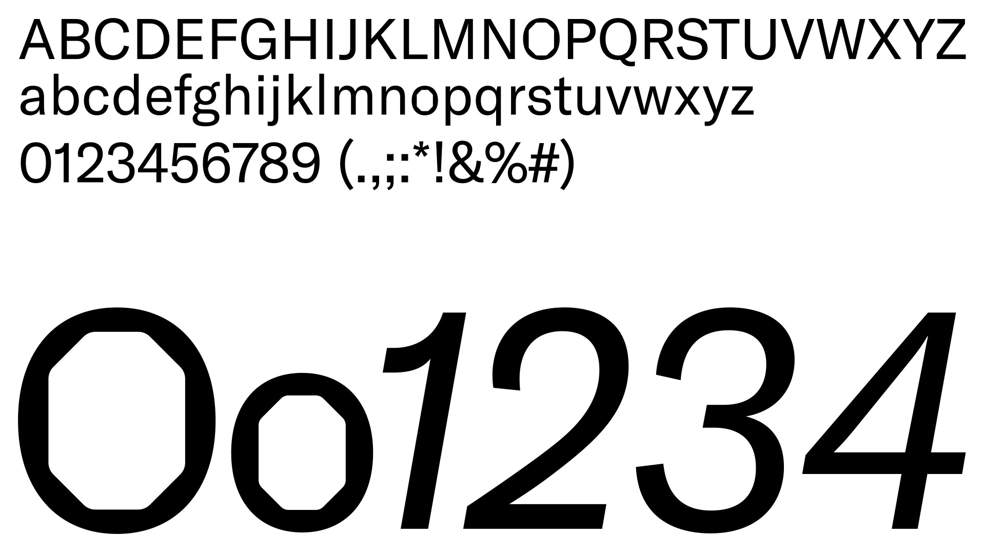
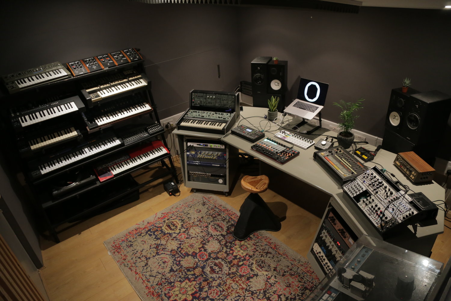
We enlisted the skills of designer Thorbjorn Gudnason to create a visual identity and logo to match the new name. The octagonal shape was applied to the inside of the letter ‘O’ to form a distinctive yet clean logotype built on the typeface GT America. The industrial, “sprocket” shape echoes the knobs on the studio’s collection of vintage analog equipment.

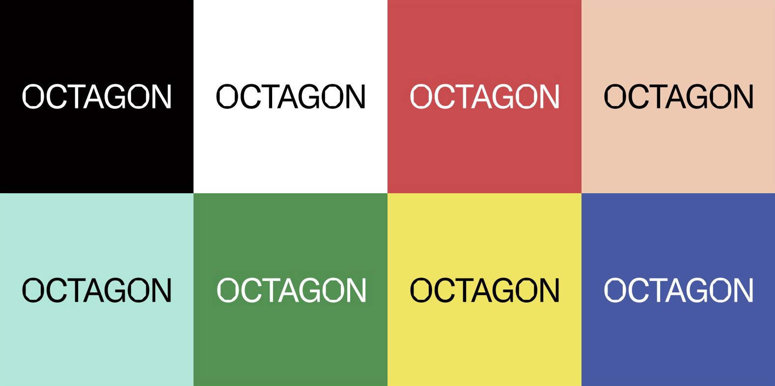

The bold “space orange” brand color stands out amongst traditionally neutral-colored studios, and against London’s monochrome gray skies.

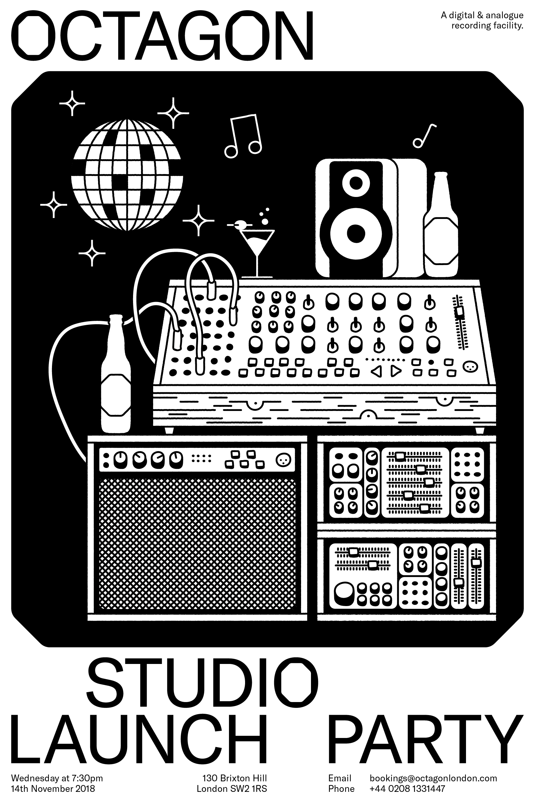
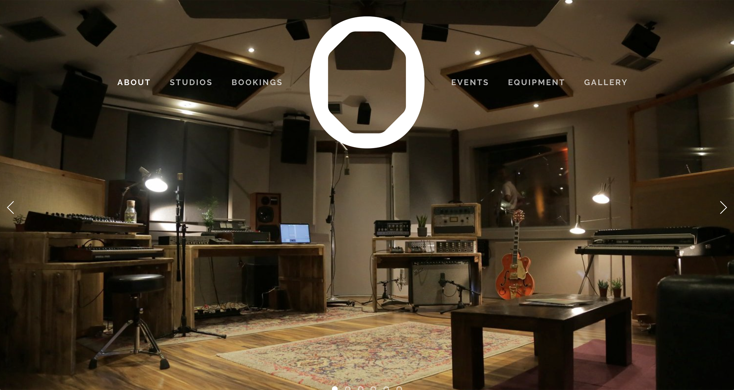
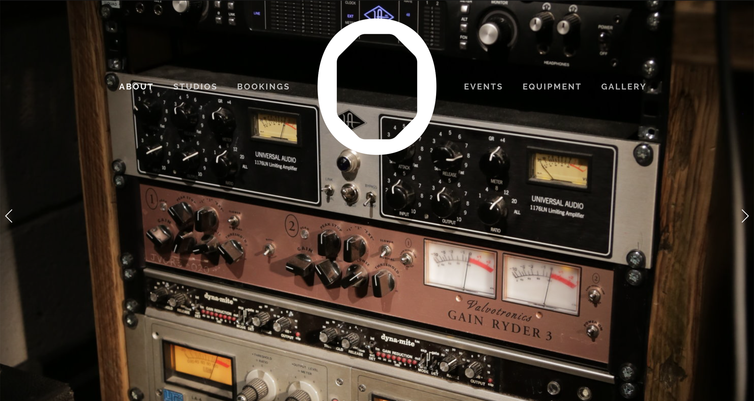
The signature ‘O’ was overlaid on studio photos and web landing pages showcasing the renovated space, and on computer backdrops throughout the suites. The logotype and geometric framing were applied to promotional graphics promoting the studio’s reopening party.

Photos by Andrea Trabucco Campos